Monday, March 31, 2014

Cartograms

http://inhabitat.com/worldmapper-cartogramps-revisualize-the-world/

A cartogram map is a map created by substituting a different standard of measurement for distance or area. Many times the area or space is distorted to convey the information. This map is a cartogram of the CO2 emissions in 2000. The size of the country is directly proportional to the emission of CO2 the country produces. The United States, China, and India are large contributors to the CO2 emission while Australia and most of Africa release little CO2 emission.

Flow Map

http://geography-student.blogspot.com/2011/12/apologisesfor-being-on-quiet-side-with.html
Flow maps show the linear movement between places. The width of the flow lines is proportional to the quantity. In regards to location and travel path, flow maps only show the general direction, not the actual path. This map displays the major international trade movements in crude oil in 1999. A large amount was distributed out of Saudia Arabia.

Isoline Maps

http://regentsprep.org/Regents/core/questions/questions.cfm?Course=ESCI&TopicCode=07

An isoline map conveys the numerical value for continuous distributions by means of lines joining points of the same value. This isoline map displays the average annual precipitation in New York for the past twenty five years.

Proportional Circle Map

https://www.e-education.psu.edu/natureofgeoinfo/book/export/html/1553

In a proportional circle map the size of the circle is directly proportional to the value of the data. In this map, the Hispanic population in the United States is displayed. The variation in the size of dots is related to the population of Hispanics. California has a high amount of Hispanics while Alaska has a very small dot representing a very small Hispanic population.

Dot Distribution Map


http://www.nrcs.usda.gov/wps/portal/nrcs/detail/null/?cid=nrcs143_013772

A dot distribution map uses dots to describe a specific quantity of a given variable. The goal of a dot distribution is to provide a visual image in the variation in the density of a distribution. This map displays the acres of non-federal wetlands in 1992. It can be seen that along the coast of the south east there is a high concentration of non-federal wetlands.

Thematic Map

http://www.colocarto.com/custom-thematic-maps
Thematic maps display information about a certain topic rather than display terrain. Variables can easily be compared due to a common theme. This map a thematic map in that it displays the estimated median household income in 2008 in the United States. This particular map could also be considered a choropleth map.

Planimetric map

http://www.geocraft.com/WVFossils/Penn_planimetric_map.html
A planimetric map is a surface map with no relief features. Street maps are a common example of a planimetric map. This planimetric map displays the ancient continents of Laurussia and Gondwana.

Sunday, March 30, 2014

Doppler Radar

http://gis3015erickson.blogspot.com/2010/04/doppler-radar.html

Doppler Radar uses microwaves to track direction and speed of suspended water droplets in the atmosphere. Doppler radar determines whether atmospheric motion is horizontally toward or away from the radar. This is a radar image of a hurricane passing over Florida.

Nominal Area Choropleth

https://courseware.e-education.psu.edu/courses/geog482/policies.shtml

Nominal area choropleth maps show data in categories rather than numerical value. This map displays the minority group with the highest percent of state population.

Unstandardized Choropleth

http://andrewhomaps.blogspot.com/2011/04/unstandardized-choropleth-map.html

Unstandardized choropleth maps use raw data rather than standardizing the data. By maintaining the raw data, the data maintains its original value. This map displays the unemployment rate. It can be assumed that Michigan and California have much higher rates of unemployment than those in Virginia or Texas.

Standardized Choropleth

http://www.missourieconomy.org/newsletter/hispanic_pop2008.html
A standardized choropleth map aerially averages data. The data is standardized to some unit, typically area, meaning it is not just a total value. This map displays the Hispanic population percentage in Missouri with a variance of color for each interval of population percentage.

Univariate Choropleth

http://www.rkpjrhist615.wordpress.com/2007/12/07/

Univariate choropleth maps only display one set of aerial data statistics unlike bivariate which displays two. This map uses a gradual variation of color to display the percentage of people 35 years and over who have a bachelor's degree in the United States.

Bivariate Choropleth

http://www.geo.unizh.ch/~annal/Choropleth%20maps.html

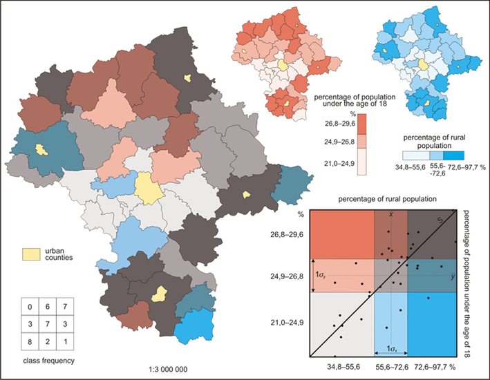
Bivariate Choropleth maps are distinct in that they compare two variables. In this map percentage of rural population and percentage of population under 18 is compared. Bivariate maps can be hard to read becuase of the variation of color. Population of rural population is represented by blues while percentage of population under 18 is red. When combined, the two data set create different colors which are hard to read and/or could easily be misinterpreted. 

Unclassified Choropleth map

http://www.esds.ac.uk/government/vitals/guide/

Unclassified choropleth maps are similar to classified choropleth maps in that they both portray areal data but differ in the unclassified choropleth maps use a continuous scale and therefore doesn't have classification intervals. This map provides information of infant mortality. From the shading technique of unclassified maps, the color of the country can be directly related back to the actual statistic rather than falling into a range numerical values.

Classed Choropleth Map

https://www.msu.edu/~dougl126/lab4.html

Classed Choropleth maps are characterized by areal units combined into a smaller number of groups and portrayed in intervals. This particular map is characterized with five intervals to show the breast cancer rates in white women. By analyzing this map, it appears that there is a high concentration of breast cancer in the north east of the United States and a much lower concentration in the southern states. The four classification techniques of classed cloropleth maps are equal steps, quantiles, natural breaks, and minimum variance. The interval for this map used the classification technique of equal steps. 

Mental map

http://www.geog.ucsb.edu/mapsandsociety/slides/thematic/cartoons/index.html

A mental map is a map that is specific to a persons point of view. Mental maps are abstracted representations of the world. Every day aspects of ones life tends to highly affect the accuracy or the detail of a mental map. For example, if two people were asked to make a map of a beach town, someone who lives in Kentucky is likely to make an extremely different make than someone who lives on the beach in Florida. The map above is a mental map of the world. I would suspect that the person who created this map lives in North America because the shape and detail of North America is more accurate and precise than that of Africa, which was drawn as a triangle. One of the most interesting aspects of mental maps is that there is no "wrong" or "inaccurate" way to produce them. They are completely subjective to interpretation.