Wednesday, April 16, 2014

Lorenz Curve

http://ingrimayne.com/econ/AllocatingRationing/MeasuringIncomeDist.html
A Lorenz curve is a graphical method that portrays the proportionality of distribution of an area. The Lorenz curve is compared to the line of equality. This Lorenz curve displays inequality. The further the Lorenz curve is from the line of equality, the more diversity of the sample.

Histogram

http://visualign.wordpress.com/2011/10/06/number-of-neighbors-for-world-countries/

A histogram is a graphical representation of the data grouped into ranges and then displayed in bars. This histogram displays the amount of neighbors each country has of 239 world countries. For example, 27 countries have five neighbors. It is common to have zero neighbors due to islands.

Cartographic Animation

http://climvis.org/content/global.htm

Cartographic animations convey change over time for a specific variable. Cartographic animations combine a series of maps to display the change. For example, the cartographic animation above can be used to display the change of precipitation rate of the Earth.

Isopleth

http://dwb4.unl.edu/Chem/CHEM869V/CHEM869VLinks/weather.about.com/newsissues/weather/library/weekly/aa071600a.htm

Isopleth maps are used when representing a continuous variable. The data points are conceptual in that they are collected over an area rather than point locations. This type of map is convenient for displaying gradual change over an area. This map conveys the gradual differences of pH from acid rain in 1998. The east side of the United States may have a lower concentration of hydrogen ions, meaning more acidic, due to the industrial factories.

Bilateral Graph

http://www10.iadb.org/intal/cartamensual/Cartas/Articulo.aspx?Id=b5ecd152-8858-41ae-b2b0-e9e16775bd34&lang=en

A bilateral graph is similar to the representation of a bar graph except it conveys two variables. This bilateral graph conveys the imports and exports of the Mexico-Argentina trade. In 2003 the imports were extremely low compared to the imports of 2010. The import rate has a gradual increase while the exports has a subtle decrease from 2003-2010.

Scatterplot

http://www.governing.com/news/state/gov-biking-walking-cities-obesity-study.html

Scatter plots display a comparison of two different variables in which the points on the graph are the comparison of the two data. This plot compares the two variables of percentage of walkers or bike commuters to the percent of commuters who are neither over weight nor obese.

Population Profile

http://www.fdbetancor.com/2012/06/04/the-american-century/

A population profile is a way to evaluate the demographics of a country. Population profiles display the age and population of each gender. The youngest age groups are at the bottom while the top are the oldest of the population. If the base of the graphic is large with a narrow top, it implies that the population is growing. For example, this population profile displays a growing population with a wide base is 2010 for India. That analysis is mirrored in the projection of India in 2050. The projection in 2050 also leads to the assumption that the population stabilizes.

Climograph

http://www.earthonlinemedia.com/ipg/outlines/lecture_climate_class.html

A climograph is a graphical  representation of the precipitation and the temperature of a certain location. This is a climograph of Memphis, Tennessee. The precipitation level is represented by the blue bars while the temperature is represented by the red dots. When compared together, the precipitation level and temperature can be used to evaluate the climate.

Windrose


http://nj.usgs.gov/grapher/tutorial/examples.html

Wind-rose images display the distribution of wind direction and wind speed. This is a wind-rose of Klamath Falls, Oregon. It can be observed from the wind-rose that there was a high wind speed in the north-north west while the mean wind speed was 2.59 m/s.

Triangular Plot

http://ih-igcse-geography.wikispaces.com/4.2+Graphing+Economic+Activity

Triangular plots are characterized with three independent variables on each side of the triangle. The photo above is a triangular plot of the percent agriculture, services, and industry of Asian countries and large cities. For example, Vietnam has a low percent services at 29%, a high agriculture percent at 73%, and a industry of 50%. The graph allows for multiple comparisons of variables to be observed.

Parallel Coordinate Graph

http://pandas.pydata.org/pandas-docs/version/0.9.0/visualization.html

 A parallel coordinate graph displays each variable as the column while the rows are represented with a point on the column. The lines stay connected for each data set. The photo above represents a parallel coordinate graph in that the sepal width, sepal width, petal length, and petal width are the variables being analyzed while the row is the quantitative data with points representing either the width or length of each variable.

Box Plot

http://junkcharts.typepad.com/junk_charts/boxplot/

A box plot is frequently used in statistics to convey graphical statistics by displaying the maximum values, minimum value, the first quartile, the third quartile, and the median. The lowest point is the minimum values while the highest point is the maximum value. The top of the box represents the third quartile and the bottom represents the first quartile. The bar in the middle of the box is the median of the data set. Through box plots, statistical data is easily be evaluated. For example, the photo above displays the vanity height of buildings in China, USA, UAE, and others. The maximum in the United States is about 37% while the minimum is about 2%. The third quartile is close to 21%, the first quartile around 3%, and a median of 6%. These percentages can be compared to other, while outliers must be taken into consideration.

Stem and Leaf Plot

http://mainland.cctt.org/mathsummer/josephbond/stemandplots/stem-and-leaf_std.htm

A stem and leaf plot is used to display quantitative rather than qualitative data. The data is further divided by using a stem and leaf system. The stem is the first part of the number while the leaf provides the rest of the data. For example, the a stem in the photo above for GNP per capita in Western Africa is 1-8, representing the hundreds place. The numbers on the right hand side would be considered the leaf, containing the tens place. So if the stem is 3 and the leaf is 70, the GNP would be $370.

Star Plots

http://andrewpwheeler.wordpress.com/2012/03/14/reference-lines-for-star-plots-aid-interpretation/

Star plots are used to display data with multiple variables. Each branch represents a specific variable. Multiple star plots can be used to compare data and conclude results. These star plots have 12 variables that can be compared and analyzed in difference and similarities between each unit.

Monday, April 14, 2014

Continuously Variable Proportional Circle Map

http://lotsofmaps.blogspot.com/2010/12/continuously-graded-proportional-circle.html
A continuously variable proportional circle map is one of two types of proportional circle maps. In continuously variable proportional circle maps, the circles come in all different sizes representing a direct relationship between the data and the circle. This map of newspaper endorsements in the 2008 US presidential election provides a source of comparison for the amount of endorsements for each party/location. The variance in the size of circles makes the analysis amusing!

Range Graded Proportional Circle Map

http://www.e-cartouche.ch/content_reg/cartouche/cartdesign/en/image/them_map/geometric_symbols.jpg

A range graded proportional map portrays data by only using a set amount of circles to represent the data. This map conveys the inhabitant population in Zurich. The scale only uses four circle sizes to portray the data. The largest circle represents the largest population while the smallest circle represents the smallest amounts of inhabitants.

Digital Raster Graphics (DRG)

http://www.tceq.state.tx.us/gis/metadata/drg_met.html
A digital raster graphic is a scanned and rectified image of a U.S. Geological Survey standard series topographic map. The map above is a DRG of Texas close to Austin and Coxville.

Digital Line Graphs (DLG)

http://proceedings.esri.com/library/userconf/proc00/professional/papers/pap691/p691.htm

A Digital Line Graph (DLG) uses vector data, meaning the geographic information is coded in points, lines (arcs), and polygons (areas). DLGs can convey a multitude of information because of its ambiguity. This map is a DLG of roads. You can clearly see the intersections from this DLG.

Digital Orthographic Quarter-Quads (DOQQ)

http://www.ruraltech.org/gis/map_info/basic_data/images/asp_pages/dop_doqq.asp

Digital orthographic quarter-quads (DOQQ) uses an aerial photograph then georeferences and orthorectifies the photo to give the photo geometric qualities of a map. Orthorectification removes any distortion from the photograph so it can be used as a flat map. This allows for ground features to be displayed in their true position. Unlike generalized maps, DOQQs provide the same amount of detail for different elevations. This map is a DOQQ of Necadah, WI. Notice how the aerial photo portrays all of the different elevations equally.

Digital Elevation Models (DEM)

http://fmepedia.safe.com/articles/Samples_and_Demos/3D-Textured-Examples

A digital elevation model (DEM) consists of terrain elevations for ground positions at regularly spaced horizontal intervals. DEMs use the raster format, meaning the geographical information is coded in pixels. This is a digital elevation model of the Earth. The elevations and depths can be observed. The white patch in Asia is the Himalayas.

Infrared Aerial Photo

http://www.math.toronto.edu/drorbn/Gallery/KnottedObjects/Interchange/index.html

Infrared aerial photography uses technology sensitive to infrared emulsion. Infrared is sensitive to wavelengths that are out of the range of human vision. Many color photos are produced using infrared technology. Since the wavelengths are outside of the human vision, false coloring is used when analyzing he wavelengths recorded on the film. Above is an infrared aerial photo of a highway in Baltimore. The colors portrayed are not the actual colors of the highway and the surrounding area. By using the infrared spectrum, the trees are highly distinguishable in comparison to black and white aerial photography.

Black and White Aerial Photo


Black and white aerial photographs are taken from the sky using black and white emulsion sensitivity to take a photograph with approximately the same wavelengths as the human eye. This photo is a black and white aerial map taken at 20,000 feet of a highway in Baltimore. No color is seen, hence why it is called balck and white aerial photography.

Propaganda Map

http://neatmap.blogspot.com/2011/04/propaganda-map-ronald-reagans-world.html

Propaganda maps are purposefully distorted to convey a political ideal. This cartographic technique is used for political persuasion and many times leads to disputes or misinterpretations. Above is a propaganda map representing, "the world according to Ronald Reagan." The cartographer uses distortion to portray USA as the largest, most powerful country in that it claims rights to land outside our territory. For example, there is "our oil" in the Middle East, instead of a united country of China there is "their China" and "our China," and Africa is extremely small representing Ronald Reagan's lack of care for that continent.

Sunday, April 13, 2014

LiDAR

http://soundwaves.usgs.gov/2007/06/pubs.html

Light detection and ranging (LiDAR) uses laser pulse technology to measure varying distances to create an image. The laser is sent out in pulses and the light reflected is analyzed to create an image. This photo is a LiDAR image of a landslide. Through the LiDAR technology, the depth and texture of the landslide can be portrayed.

Choropleth Map


Choropleth maps convey areal data by units such as counties or states. Choropleth maps summarize the distribution of a topic through the boundary lines. There are many different categories of choropleth maps: standardized, nominal area, bivariate, etc. This map is a choropleth map conveying Africa's variation of climate per country. The boundary being evaluated would be the individual countries in the continent of Africa.

Wednesday, April 2, 2014

PLSS map

http://www.idwr.idaho.gov/GeographicInfo/Publications/adjudica.htm

The United States uses a systematic partitioning system called the U.S. Public Land Survey system (PLSS). The PLSS covers most of the United States except the original 13 colonies, most of Florida, Louisiana, Texas and some parts of New Mexico and California. PLSS displays land ownership. Plots are formed by 6 x 6 grids called townships. Principal meridians and baselines run from an initial point. This map displays the PLSS of the Opalene Gulch in Idaho.

Cadastral Maps


http://www.cadastraltemplate.org/fielddata/d2.htm

Casdastral maps, also known as land partitioning, were originally created to convey land ownership. There are two types of cadastral maps, systematic and unsystematic. Unsystematic is hardly in use today. This map displays the land ownership in Cyprus as well as some of the streets surrounding the plots. 

Isobars

http://www.ametsoc.org/amsedu/dstreme/extras/usr_guide/sfc_pres.html

Isobar maps convey air pressure through the use of contour lines. Isobar maps are frequently used to predict the weather. This map conveys the high and low air pressure of the United States. This map displays low pressure in the north east while in the middle of the United States has very high air pressure.

Isotach

http://www.underthemeso.com/blog/?s=isotach&feed=rss2

Isotach maps convey the wind speed of an area through the use of contour lines. This is a isotach map of the Great Plains. The wind speed and direction can be analyed through this map.

Isopach


Isopach maps show rock or sediment thickness through contouring. This is a map of rocks in the Victory field in Kansas. This map displays the difference in thickness of the rocks.

Isohyets

http://www.hko.gov.hk/wxinfo/pastwx/mws201206.htm

An isohyets map is a type of contour map which displays rainfall through lines. This map is an isohyet map of the rainfall in Hong Kong in June of 2012. The lines provide information to the amount of rainfall that occured in a specific region. The maximum amount of rain happened in the north and gradually decreased spreading out from that focal point.

Hypsometric Map

http://www.earthexplorer.com/2009-03/subsurface_geology_challenges_goiania_metro.asp

A hypsometric map is a surface map in which three dimensional information is provided through the display of relief. Although the third dimension is displayed by relief, it can also be displayed by color and shaping, contour lines, or raised relief. This map is a topographic hypsometric map which uses relief and color to display the Goiania metropolitan area.

Statistical map

http://www.censusscope.org/us/map_unmarried.html

Statistical maps convey distance between geographical locations based on calculated values. The map above is a statistical map displaying the percent of households in a county consisting of unmarried partners of the same or opposite sex. The north east has a high percentage (2.6%-4.6%) compared to Utah which has a low percentage (0.0%-1.2%) of households in a county consisting of unmarried partners of the same or opposite sex.

Monday, March 31, 2014

Cartograms

http://inhabitat.com/worldmapper-cartogramps-revisualize-the-world/

A cartogram map is a map created by substituting a different standard of measurement for distance or area. Many times the area or space is distorted to convey the information. This map is a cartogram of the CO2 emissions in 2000. The size of the country is directly proportional to the emission of CO2 the country produces. The United States, China, and India are large contributors to the CO2 emission while Australia and most of Africa release little CO2 emission.

Flow Map

http://geography-student.blogspot.com/2011/12/apologisesfor-being-on-quiet-side-with.html
Flow maps show the linear movement between places. The width of the flow lines is proportional to the quantity. In regards to location and travel path, flow maps only show the general direction, not the actual path. This map displays the major international trade movements in crude oil in 1999. A large amount was distributed out of Saudia Arabia.

Isoline Maps

http://regentsprep.org/Regents/core/questions/questions.cfm?Course=ESCI&TopicCode=07

An isoline map conveys the numerical value for continuous distributions by means of lines joining points of the same value. This isoline map displays the average annual precipitation in New York for the past twenty five years.

Proportional Circle Map

https://www.e-education.psu.edu/natureofgeoinfo/book/export/html/1553

In a proportional circle map the size of the circle is directly proportional to the value of the data. In this map, the Hispanic population in the United States is displayed. The variation in the size of dots is related to the population of Hispanics. California has a high amount of Hispanics while Alaska has a very small dot representing a very small Hispanic population.

Dot Distribution Map


http://www.nrcs.usda.gov/wps/portal/nrcs/detail/null/?cid=nrcs143_013772

A dot distribution map uses dots to describe a specific quantity of a given variable. The goal of a dot distribution is to provide a visual image in the variation in the density of a distribution. This map displays the acres of non-federal wetlands in 1992. It can be seen that along the coast of the south east there is a high concentration of non-federal wetlands.

Thematic Map

http://www.colocarto.com/custom-thematic-maps
Thematic maps display information about a certain topic rather than display terrain. Variables can easily be compared due to a common theme. This map a thematic map in that it displays the estimated median household income in 2008 in the United States. This particular map could also be considered a choropleth map.

Planimetric map

http://www.geocraft.com/WVFossils/Penn_planimetric_map.html
A planimetric map is a surface map with no relief features. Street maps are a common example of a planimetric map. This planimetric map displays the ancient continents of Laurussia and Gondwana.

Sunday, March 30, 2014

Doppler Radar

http://gis3015erickson.blogspot.com/2010/04/doppler-radar.html

Doppler Radar uses microwaves to track direction and speed of suspended water droplets in the atmosphere. Doppler radar determines whether atmospheric motion is horizontally toward or away from the radar. This is a radar image of a hurricane passing over Florida.

Nominal Area Choropleth

https://courseware.e-education.psu.edu/courses/geog482/policies.shtml

Nominal area choropleth maps show data in categories rather than numerical value. This map displays the minority group with the highest percent of state population.

Unstandardized Choropleth

http://andrewhomaps.blogspot.com/2011/04/unstandardized-choropleth-map.html

Unstandardized choropleth maps use raw data rather than standardizing the data. By maintaining the raw data, the data maintains its original value. This map displays the unemployment rate. It can be assumed that Michigan and California have much higher rates of unemployment than those in Virginia or Texas.

Standardized Choropleth

http://www.missourieconomy.org/newsletter/hispanic_pop2008.html
A standardized choropleth map aerially averages data. The data is standardized to some unit, typically area, meaning it is not just a total value. This map displays the Hispanic population percentage in Missouri with a variance of color for each interval of population percentage.

Univariate Choropleth

http://www.rkpjrhist615.wordpress.com/2007/12/07/

Univariate choropleth maps only display one set of aerial data statistics unlike bivariate which displays two. This map uses a gradual variation of color to display the percentage of people 35 years and over who have a bachelor's degree in the United States.

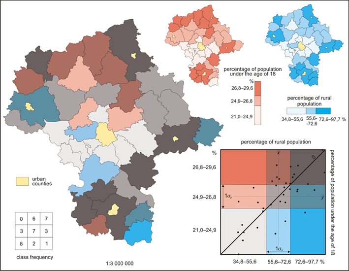
Bivariate Choropleth

http://www.geo.unizh.ch/~annal/Choropleth%20maps.html

Bivariate Choropleth maps are distinct in that they compare two variables. In this map percentage of rural population and percentage of population under 18 is compared. Bivariate maps can be hard to read becuase of the variation of color. Population of rural population is represented by blues while percentage of population under 18 is red. When combined, the two data set create different colors which are hard to read and/or could easily be misinterpreted. 

Unclassified Choropleth map

http://www.esds.ac.uk/government/vitals/guide/

Unclassified choropleth maps are similar to classified choropleth maps in that they both portray areal data but differ in the unclassified choropleth maps use a continuous scale and therefore doesn't have classification intervals. This map provides information of infant mortality. From the shading technique of unclassified maps, the color of the country can be directly related back to the actual statistic rather than falling into a range numerical values.

Classed Choropleth Map

https://www.msu.edu/~dougl126/lab4.html

Classed Choropleth maps are characterized by areal units combined into a smaller number of groups and portrayed in intervals. This particular map is characterized with five intervals to show the breast cancer rates in white women. By analyzing this map, it appears that there is a high concentration of breast cancer in the north east of the United States and a much lower concentration in the southern states. The four classification techniques of classed cloropleth maps are equal steps, quantiles, natural breaks, and minimum variance. The interval for this map used the classification technique of equal steps. 

Mental map

http://www.geog.ucsb.edu/mapsandsociety/slides/thematic/cartoons/index.html

A mental map is a map that is specific to a persons point of view. Mental maps are abstracted representations of the world. Every day aspects of ones life tends to highly affect the accuracy or the detail of a mental map. For example, if two people were asked to make a map of a beach town, someone who lives in Kentucky is likely to make an extremely different make than someone who lives on the beach in Florida. The map above is a mental map of the world. I would suspect that the person who created this map lives in North America because the shape and detail of North America is more accurate and precise than that of Africa, which was drawn as a triangle. One of the most interesting aspects of mental maps is that there is no "wrong" or "inaccurate" way to produce them. They are completely subjective to interpretation.

Tuesday, February 11, 2014

Topographic Map


http://www.dcski.com/lostareas/viewlostprofile.php?id=24

This is a topographic map of a ski area. Topographic maps use contour lines to portray elevation and shape of land. This map qualifies to be considered a topographic map because it displays the three dimensional terrain on a two dimensional surface through contour lines and color. The map conveys hills and spurs of the ski area.